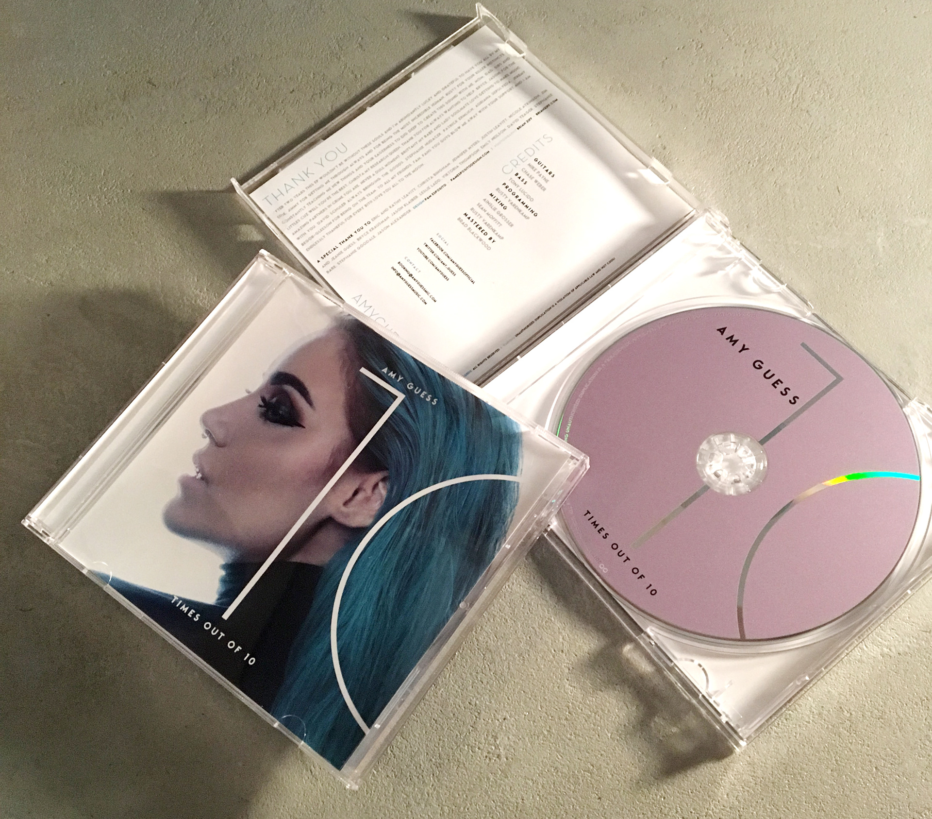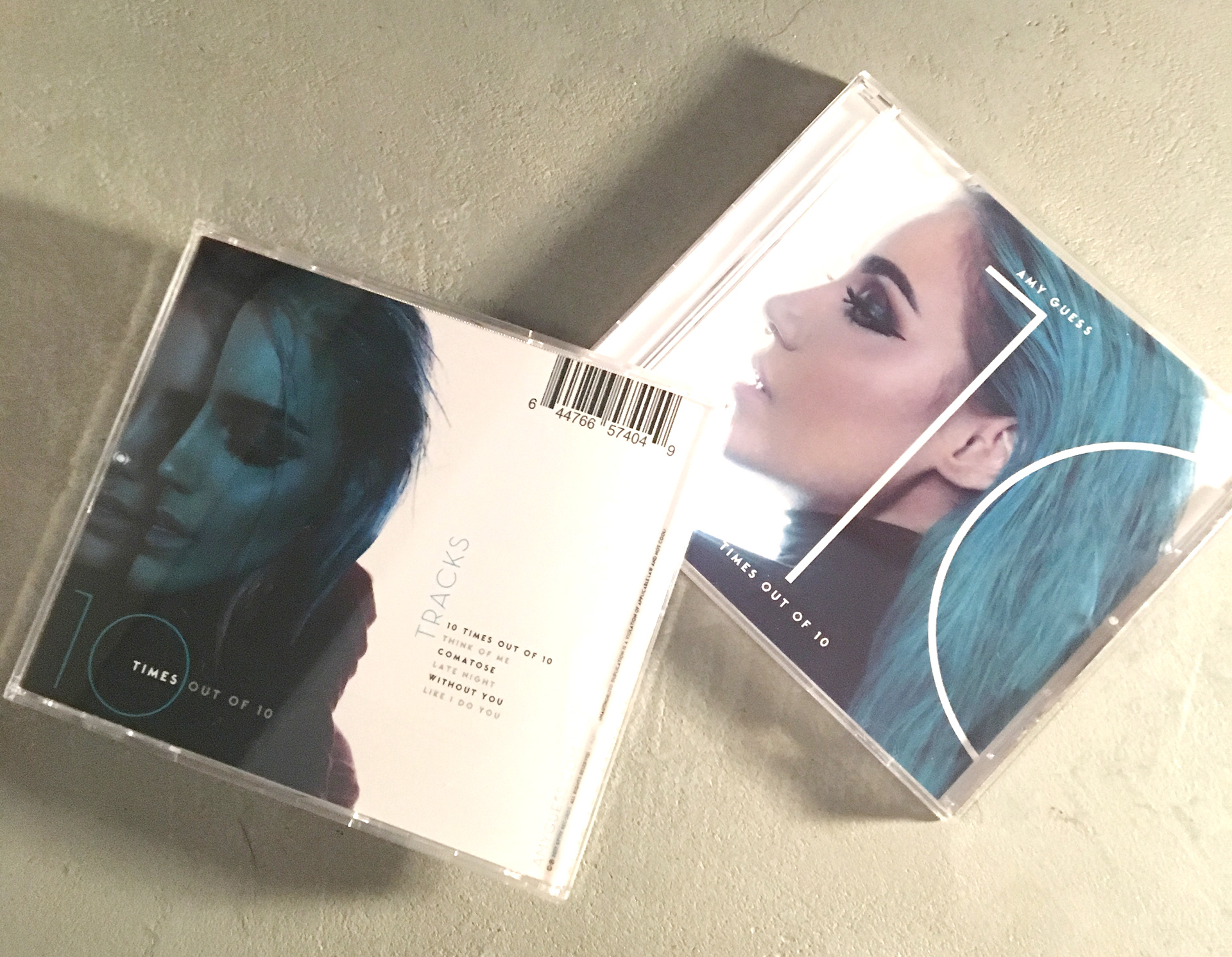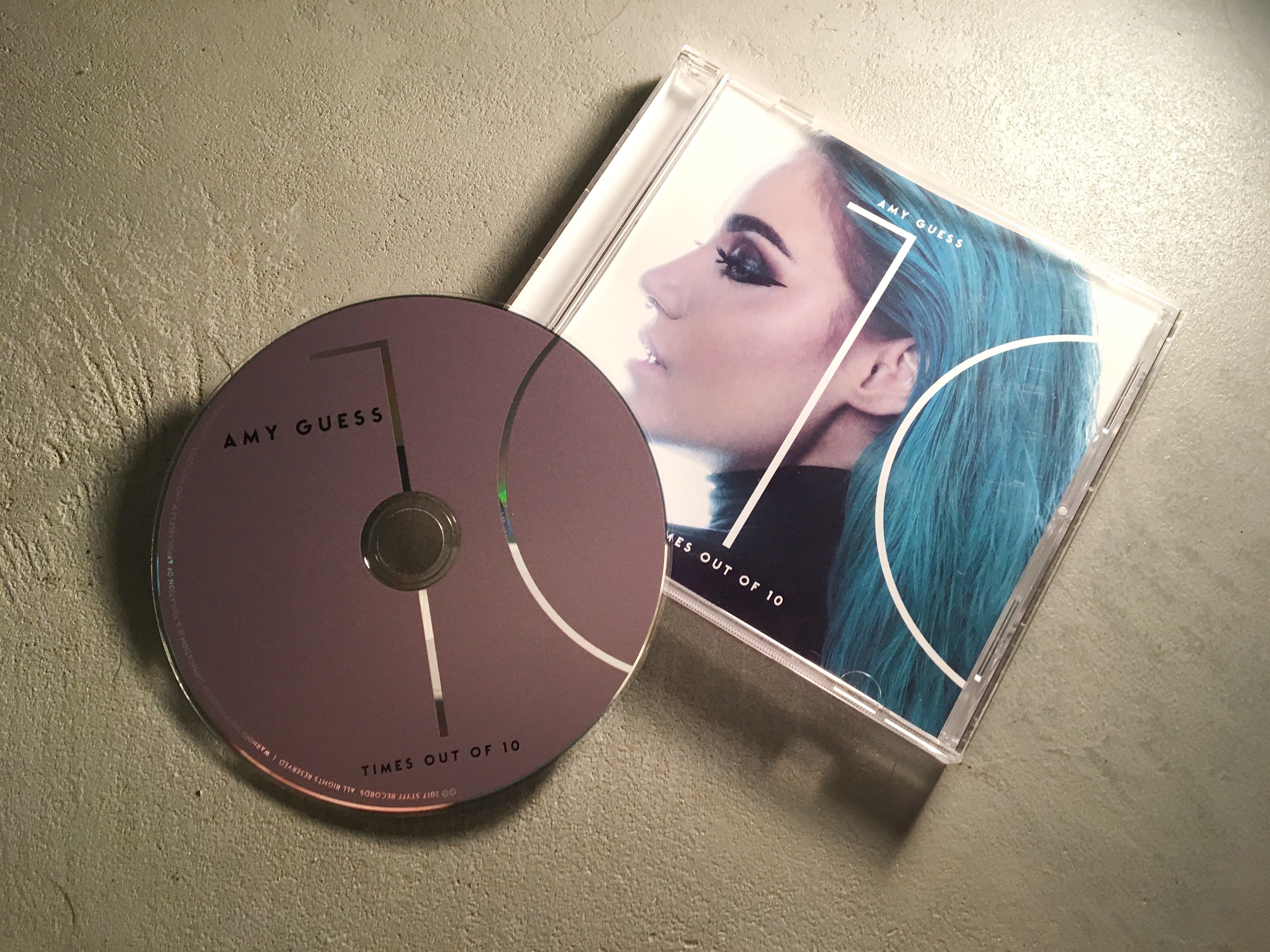
It was a pleasure to work with Amy and her manager Jimmy. Amy was having a hard time getting the right look and feel for her music and had gone through several attempts at her packaging. From our first phone conversation I knew we were a great fit! Amy loves typography (who does not?!?) and wanted a very modern and minimal design. We selected the images and kept every thing very tasty by using a metallic purple for the CD face and colors that were in perfect harmony with the images. Going back to using the clear cases of days gone by gave this thing a little retro vibe & hip feel.