To call the Medvision project a simple “rebranding” is an underestimation of the scope of the work. When the director of Medvision Solutions approached myself and 5D Spectrum about a new web site for the company it became very clear in that initial meeting that what we were stepping into was going to be a complete overhaul and we would be redirecting every aspect of how the company positioned itself in the public marketplace.
Learning the MV business and the product (QuickCAP) was key. Even with our background experience in the health care industry, wrapping our brains around how to communicate such complex systems to its audience was really going to take some creative thinking!
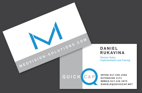
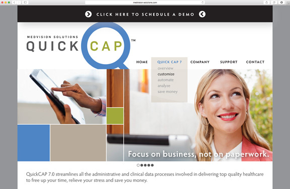
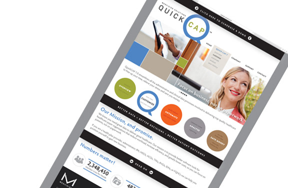
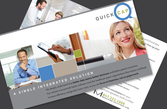
Items created for Medvision / Quick CAP include: Responsive Web Site, Style Guide, Trade Show Visuals, Sales Team Presentation Materials, Corporate Communication Materials, Logos and Company Overview Brochure.

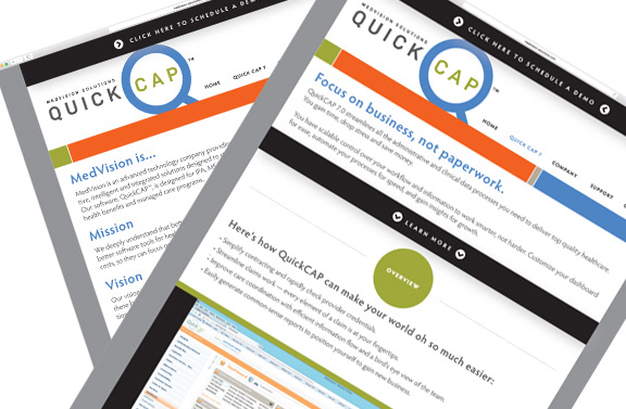
The first step was to evaluate all the content, we took it down to the essence and then built in some personality to appeal to the core users. We always had the goal in mind of communicating the big message - that the product was “easy to use” and would give them back valuable time. From there, extensive image research was conducted to provide them with a usable library that would keep the mood and tone on target. A detailed style guide was formulated as a system for guiding any in-house materials they may create.

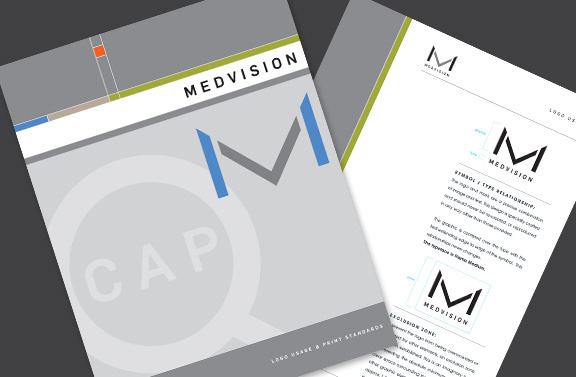
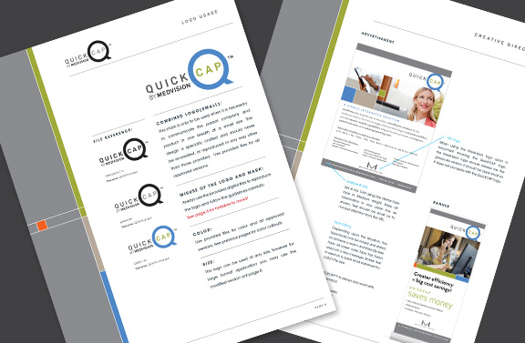
Because of the complexity of the company structure, several logos and to be developed. The core logos that identify each property as well as versions that were worked out of how both QuickCAP and Medvision would be used together